Spring has a way of making your wardrobe feel alive again. After months of dark coats, muted layers, and practical neutrals, a fresh color can change your entire mood—even when the outfit itself is simple.
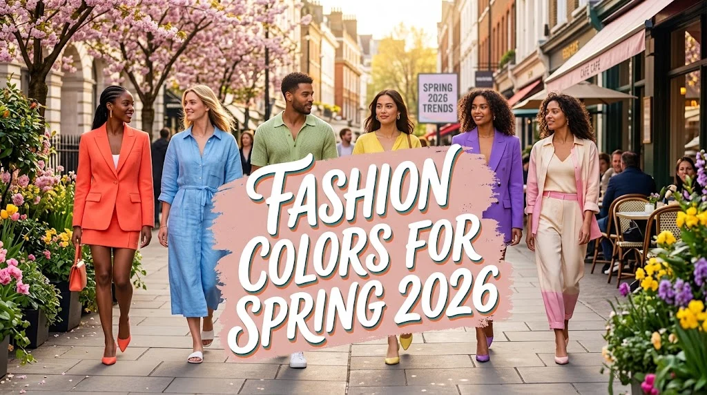
The exciting part about fashion colors for spring 2026 is that there is no single shade you need to wear to look current. The season brings together soft pastels, creamy neutrals, earthy tones, rich jewel colors, and energetic brights. In other words, spring fashion is giving you more freedom rather than another strict rulebook.
Runway collections for Spring/Summer 2026 show a strong interest in personal expression. Pantone describes the season as a meeting point between familiar warm shades, stimulating colors, and foundational tones, while WGSN’s runway analysis also points toward wearable mid-tones alongside more vibrant colors.
That makes this season especially practical for everyday dressing. You can wear a dramatic color from head to toe, add one bright accessory to a neutral outfit, or simply replace your usual beige with a softer blue or creamy white.
Here is how to understand the biggest spring color directions, choose shades that work for your wardrobe, and actually wear them without feeling like you are trying too hard.
The biggest fashion colors for spring 2026
The Spring/Summer 2026 color story is wonderfully varied. Instead of replacing neutrals with bright colors completely, designers are mixing calm shades with stronger accents.
One of the clearest directions is rich, expressive color. Vogue’s spring 2026 color report highlights shades such as violet, scarlet, emerald, creamy whites, tomato, lime, and purple.
At the same time, WGSN’s S/S 26 analysis confirms a softer side of the palette, with mid-tones gaining ground because they feel wearable, sophisticated, and versatile.
The key colors to watch include:
- Cloud Dancer and creamy white for clean, calming outfits
- Transformative Teal for a sophisticated blue-green statement
- Blue Aura for soft, cool, understated dressing
- Electric Fuchsia for bold feminine energy
- Amber Haze for warm, earthy brightness
- Jelly Mint for playful freshness
- Violet and purple for a dramatic statement
- Scarlet and tomato red for energy and confidence
- Emerald green for rich, polished color
- Lime and yellow for sunny accents
- Berry tones for a deeper alternative to traditional spring pastels
The smartest approach is not to buy something in every color. Pick two or three shades that naturally work with the clothes you already own.
Cloud Dancer and creamy white for effortless spring style
White may sound predictable for spring, but 2026 gives it a more sophisticated role.
Pantone selected Cloud Dancer as its 2026 Color of the Year, describing it as a lofty white associated with calm and reflection. Its presence fits neatly into the broader spring movement toward soft, restorative neutrals.
The beauty of creamy white is its flexibility. A crisp white shirt can look polished with tailored trousers, relaxed with straight-leg jeans, or feminine with a flowing skirt.
For a softer effect, combine different versions of white in one outfit. Try an ivory blouse with cream trousers and a warm beige handbag rather than searching for an exact color match.
If pure white feels harsh against your complexion, look for:
- Ivory
- Ecru
- Cream
- Pearl
- Soft off-white
- Vanilla
A common mistake is treating white as a summer-only color. In spring, it works beautifully with chocolate brown, tan, navy, denim, burgundy, olive, and even bright red.
For an easy everyday outfit, try a creamy knit top, relaxed blue jeans, loafers, and a structured handbag. The result feels fresh without looking overly trendy.
Transformative Teal brings depth to spring wardrobes
If you want one color that feels distinctive without being difficult to style, Transformative Teal deserves attention.
WGSN and Coloro named Transformative Teal their Color of the Year 2026. The shade sits between blue and green, giving it a cooling, restorative quality while still feeling strong enough for statement dressing.
Teal works particularly well because it can behave almost like a neutral when styled carefully.
Try a teal blouse with:
- Cream trousers
- Dark denim
- Chocolate brown accessories
- Soft gray
- Black
- Warm beige
For evening wear, teal satin or velvet can look especially luxurious. During the day, cotton, linen, jersey, and lightweight knit fabrics make the shade feel much more relaxed.
If you are nervous about wearing teal, start with a handbag, scarf, ballet flat, or lightweight cardigan.
The most common mistake is pairing teal with too many competing colors. Let it have some breathing room. One strong teal piece plus two quieter shades usually looks more polished than a rainbow of bright colors.
Blue Aura makes soft blue feel modern again
Pastel blue returns every spring, but Blue Aura gives the idea a more contemporary direction.
WGSN describes Blue Aura as a tinted, grayish blue with a soothing quality. The color can appear soft and airy, but it can also work across more futuristic or polished materials.
This is an excellent choice if you want color without making your outfit feel loud.
A Blue Aura shirt looks beautiful with white denim. A soft blue cardigan works with chocolate trousers. For a more fashion-forward combination, try muted blue with silver accessories or a deeper navy.
Blue is also one of the easiest colors to introduce into a working wardrobe.
Consider:
- A powder-blue button-down
- A soft blue blazer
- Pale blue wide-leg trousers
- A blue-gray knit
- A pastel blue handbag
For an especially elegant look, keep the entire outfit within the blue family. Mixing pale blue, medium blue, and navy creates dimension without requiring another bright shade.
Electric Fuchsia adds confidence to spring outfits
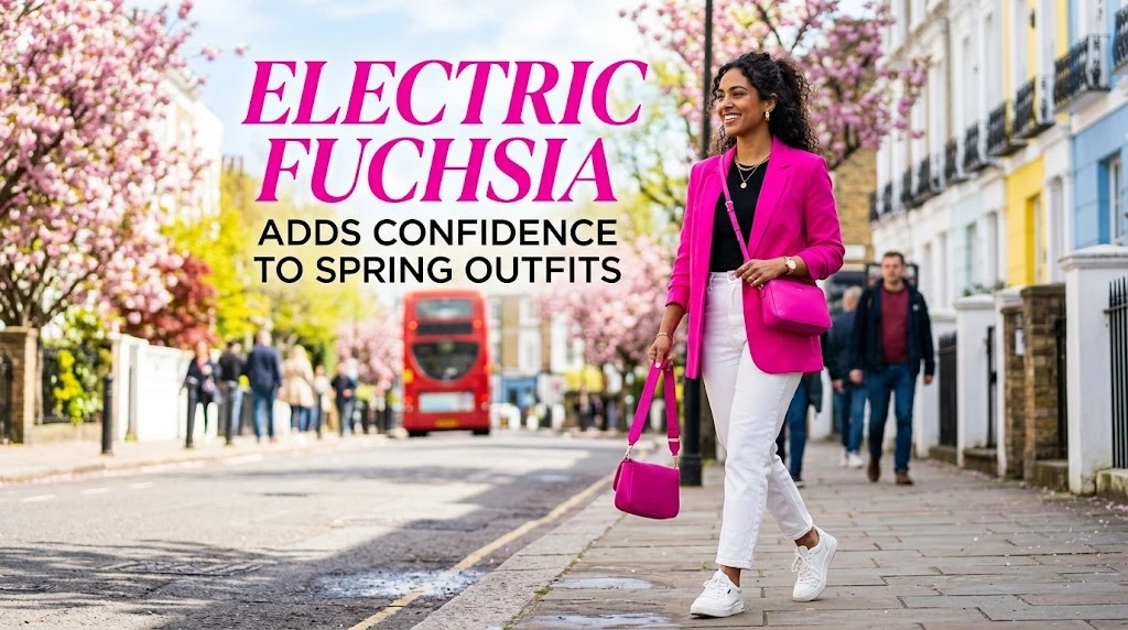
Not every spring color needs to be delicate.
Electric Fuchsia is one of the most energetic colors in the S/S 26 palette. WGSN describes it as a vivid neon pink-purple with a digital, provocative quality.
This is the shade for someone who wants their outfit to be noticed.
Because fuchsia is naturally powerful, styling it does not need to be complicated. A fuchsia dress with simple shoes and minimal jewelry can look more sophisticated than an outfit filled with several competing trends.
For everyday wear, reduce the intensity by pairing fuchsia with neutrals.
Good combinations include:
- Fuchsia + cream
- Fuchsia + chocolate brown
- Fuchsia + black
- Fuchsia + navy
- Fuchsia + denim
- Fuchsia + soft gray
You can also use the color in small doses. A bright pink shoe or handbag can transform an otherwise basic outfit.
If you have never worn vivid pink before, accessories are the easiest entry point.
Amber Haze and warm yellow tones bring sunshine without looking childish
Yellow often divides opinion. Some people love it immediately; others worry that it will make an outfit look too playful.
The 2026 direction makes yellow easier to wear because Amber Haze is warmer, richer, and more earthy than a sugary pastel yellow. WGSN describes it as a green-toned yellow with a radiant, aged quality.
This type of yellow works especially well with natural shades.
Try it with:
- Camel
- Chocolate brown
- Olive
- Cream
- Denim
- Tan leather
For warm-weather dressing, an amber-yellow dress with woven accessories can feel effortless. In the city, try an amber blouse with tailored brown trousers.
If bright yellow overwhelms you, choose a muted or golden version instead.
A useful styling trick is to repeat the warmth somewhere else in the outfit. For example, amber clothing with tan shoes and a brown bag creates a connected color story.
Jelly Mint gives spring fashion a playful edge
Mint has been part of fashion for years, but Jelly Mint gives the pastel family a more playful direction.
WGSN includes Jelly Mint among its five key S/S 26 colors, alongside Transformative Teal, Electric Fuchsia, Blue Aura, and Amber Haze.
Mint is particularly good for casual clothing because it feels light without becoming boring.
A mint T-shirt can refresh jeans. A mint skirt can work with a simple white tank. A mint cardigan can soften an otherwise dark outfit.
For a more modern combination, avoid pairing mint only with other pastels. Instead, try:
- Mint + dark brown
- Mint + navy
- Mint + charcoal
- Mint + denim
- Mint + cherry red
That last combination is especially useful if you enjoy playful color blocking.
The biggest mistake with mint is choosing too many sugary shades at once. Mixing one pastel with a grounded color gives the outfit more structure.
Red, scarlet, and tomato are powerful spring choices
Red is not disappearing for spring 2026. Instead, it continues to offer one of the easiest ways to make an outfit feel intentional.
Vogue’s 2026 spring color coverage points to scarlet and tomato among the season’s notable shades, while broader runway coverage shows designers embracing rich, saturated colors.
Red works because it can play several roles.
A red dress creates instant impact. A red cardigan adds warmth to denim. A tomato-red handbag can make a beige outfit look far more modern.
If head-to-toe red feels intimidating, use the one-piece rule. Choose one red item and keep everything else simple.
For example:
- Tomato blouse + cream trousers
- Scarlet shoes + navy dress
- Red handbag + white shirt and jeans
- Red cardigan + chocolate skirt
You can also choose your red based on the effect you want. Tomato feels warm and energetic, scarlet feels sharper, and deeper berry-red shades feel more sophisticated.
Violet, purple, and emerald make spring color feel luxurious
Spring does not have to mean pale pink and baby blue.
The 2026 runway palette includes strong jewel tones, including violet and emerald. Vogue specifically highlighted jewel-bright violet, scarlet, and emerald in its analysis of the season.
These shades are useful when you want something dramatic but polished.
Violet works beautifully with cream, gray, navy, and even deep red. Emerald pairs naturally with ivory, black, chocolate, and metallic accessories.
For formal dressing, jewel tones become even more effective when the fabric has movement or shine. Satin, silk, velvet, and fluid crepe can make a strong color look expensive without requiring elaborate styling.
For daytime, choose simpler fabrics.
A green cotton shirt with cream trousers can look just as stylish as an emerald evening gown—just in a more practical way.
Berry tones prove that dark colors can work in spring
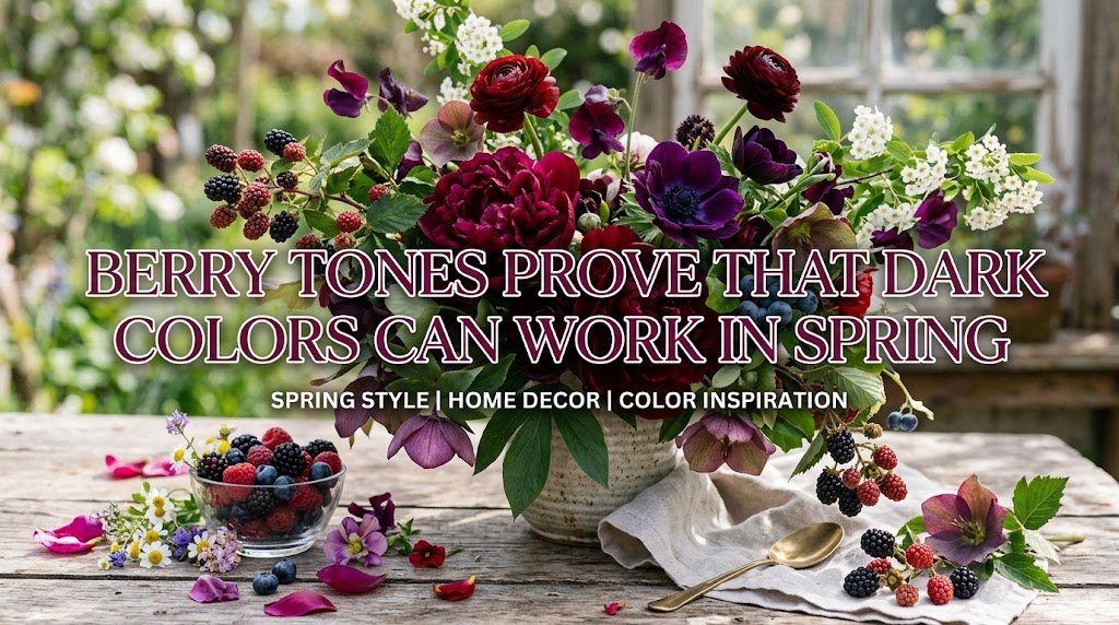
If you prefer darker clothes, you do not need to abandon them simply because the season has changed.
WGSN’s S/S 26 runway analysis notes continued growth in berry tones, describing them as dark summer colors with a timeless appeal.
This is good news for anyone who feels more comfortable in deeper shades.
Berry tones include:
- Raspberry
- Mulberry
- Wine
- Plum
- Deep cherry
- Dark cranberry
Instead of wearing black every day, replace it with a deep berry piece. The effect still feels sophisticated, but it has more color and seasonal interest.
Berry also looks surprisingly fresh with pale blue, cream, soft gray, and warm beige.
Try a berry cardigan over a white dress or a deep raspberry skirt with a simple cream shirt.
The trick is to keep the rest of the outfit uncomplicated. Rich colors already provide visual interest.
The best spring 2026 color combinations to try
Knowing individual colors is useful, but the real styling magic happens when you combine them.
Spring 2026 encourages more expressive color relationships. Pantone’s S/S 26 report specifically points toward new ways of putting colors together, balancing joyful shades with trans-seasonal neutrals and calming tones.
Here are combinations worth trying:
Cream + teal: Elegant and easy. Great for office outfits.
Blue Aura + chocolate brown: Soft blue becomes more sophisticated against a warm dark neutral.
Fuchsia + red: Bold and fashion-forward for people who enjoy saturated color.
Mint + cherry red: Playful, youthful, and surprisingly wearable.
Amber + cream: Warm, sunny, and excellent for spring weekends.
Emerald + ivory: A polished choice for dinner or special occasions.
Violet + denim: Makes a strong color feel relaxed.
Tomato red + beige: One of the easiest ways to wear bright red without looking overdressed.
Berry + pale blue: A beautiful balance between deep and delicate color.
When trying a new combination, use the 60-30-10 rule as a starting point. Let one color dominate roughly 60 percent of the outfit, use another for about 30 percent, and keep the strongest accent near 10 percent.
It is not a strict fashion law. It simply helps prevent color combinations from becoming visually chaotic.
How to choose spring colors for your skin tone
Color trends are useful, but your wardrobe should still work for you.
Skin undertone can offer a helpful starting point, although it should never become a rigid rule. The best shade is ultimately the one that makes you feel comfortable and confident.
If you have warmer undertones, you may enjoy:
- Amber
- Tomato red
- Warm cream
- Olive
- Golden yellow
- Warm teal
If you have cooler undertones, consider:
- Blue Aura
- Violet
- Fuchsia
- Emerald
- Cool pink
- Blue-based red
If your undertone is neutral, you have plenty of room to experiment with both groups.
There is another trick that matters even more: watch what happens near your face.
A color that looks beautiful as a skirt may not be your favorite as a blouse. If a strong shade makes your complexion look tired, move it farther away from your face and use it in trousers, shoes, bags, or skirts.
This is far more useful than following a strict seasonal color chart.
How to wear spring colors if you usually wear neutrals
You do not need to become a head-to-toe color person overnight.
If your wardrobe is mostly black, white, beige, gray, navy, or denim, start with one colorful item.
For example, keep your usual jeans and white shirt but add a teal handbag. Next week, try a soft blue cardigan. Later, experiment with red shoes.
This gradual approach helps you discover which colors actually fit your lifestyle.
Another easy method is to color-match your accessories.
A neutral outfit can instantly feel more current with a colorful:
- Handbag
- Belt
- Scarf
- Shoe
- Sunglasses
- Hair accessory
- Jewelry piece
You can also use denim as your transition piece. Almost every bright spring shade looks comfortable with blue jeans.
The mistake to avoid is buying an entire wardrobe in a color simply because it is trending. A color trend should inspire your wardrobe, not control it.
Spring 2026 color trends for workwear and everyday outfits
Color can make workwear more interesting without making it less professional.
For the office, start with sophisticated mid-tones and use brighter shades selectively. WGSN’s S/S 26 analysis notes the importance of wearable mid-tones alongside stronger colors, which makes this approach particularly practical.
Try a Blue Aura blouse under a navy blazer. Wear cream trousers with a teal knit. Add a berry handbag to a neutral suit.
For a creative workplace, you can go further. An emerald blazer, violet blouse, or tomato-red skirt can become the focal point of the outfit.
For everyday errands, keep the formula simpler.
A useful outfit might be:
- White or cream T-shirt
- Straight-leg jeans
- Bright cardigan
- Comfortable flats
- Simple handbag
For weekends, try a mint shirt with brown trousers or an amber dress with neutral sandals.
The goal is not to look like you walked directly from a runway. The goal is to translate runway color into clothes you can actually live in.
Common mistakes when wearing the 2026 spring color palette
Even beautiful colors can look awkward when styling becomes too complicated.
The first mistake is wearing too many statement colors at once. If you combine fuchsia, lime, red, teal, and purple in one outfit, the individual colors can lose their impact.
The second mistake is buying trendy shades that do not fit your existing wardrobe. Before buying anything, think about at least three outfits you can create with it.
The third mistake is ignoring fabric.
The same color can look completely different in cotton, satin, denim, leather, knitwear, or chiffon. A vivid color often feels more sophisticated in a matte fabric, while shine can make it appear even stronger.
Another mistake is assuming every spring outfit must be pastel. The 2026 season clearly makes room for deeper berry shades, jewel colors, and saturated brights alongside softer tones.
Finally, do not force a color simply because a trend report says it is fashionable.
Fashion works best when the trend meets your personality.
How to build a spring 2026 color wardrobe without overspending
You do not need to replace your entire wardrobe every season.
Start by checking what you already own. You may discover that your closet already contains several colors that fit the 2026 palette.
Then choose one hero color and one supporting shade.
For example:
- Teal + cream
- Fuchsia + navy
- Amber + brown
- Blue Aura + denim
- Emerald + ivory
- Berry + soft blue
Build around pieces that can create several outfits.
A colorful blazer can work with jeans, trousers, skirts, and dresses. A statement handbag can refresh five neutral outfits. A bright cardigan can work as both a top and a lightweight layer.
This approach is also more sustainable because it reduces the pressure to buy a completely new seasonal wardrobe.
Before purchasing a trend color, ask yourself three questions:
- Can I wear this color at least three different ways?
- Does it work with the shoes and bags I already own?
- Would I still like it if it stopped trending next year?
If the answer is yes to all three, it is probably a smart buy.
FAQs about fashion colors for spring 2026
What is the biggest color trend for spring 2026?
There is no single universal winner, but the season strongly favors expressive color alongside sophisticated neutrals. Teal, blue, fuchsia, berry, red, violet, emerald, creamy white, and warm yellow tones all have strong relevance. Pantone’s S/S 26 report emphasizes individuality and contrasting color combinations rather than one restrictive palette.
What is Pantone’s color for 2026?
Pantone selected Cloud Dancer, a soft, lofty white, as its 2026 Color of the Year. The shade fits the broader movement toward calming neutrals while remaining easy to wear across different seasons.
Is teal fashionable for spring 2026?
Yes. Transformative Teal is one of WGSN and Coloro’s five key colors for S/S 26 and was selected as their Color of the Year 2026. It is particularly useful because it combines the qualities of blue and green and works with both neutrals and stronger colors.
Are pastel colors still in style for spring 2026?
Yes, but the pastel story is more varied. Blue Aura offers a muted, grayish blue direction, while Jelly Mint provides a fresher green option. At the same time, the season places strong emphasis on saturated colors, so you do not need to choose between pastels and brights.
What color should I wear if I do not like bright clothes?
Start with soft neutrals such as creamy white, Blue Aura, muted beige, or gentle gray. You can then introduce stronger colors through accessories. Berry tones are another excellent option because they provide depth without the intensity of neon shades.
What colors go best with spring 2026 trends?
Cream, denim, navy, chocolate brown, beige, and soft gray are excellent grounding colors. They make stronger shades such as teal, fuchsia, red, emerald, violet, and amber easier to wear. For a more adventurous outfit, try combinations such as mint with red or fuchsia with red.
How can I look fashionable without following every color trend?
Choose one or two seasonal colors that genuinely suit your personal style, then mix them with clothes you already own. A new handbag, cardigan, blouse, shoe, or scarf can update a wardrobe without requiring a complete seasonal makeover. The best trend is always one you can wear confidently and repeatedly.
Final thoughts on spring 2026 fashion colors
The most exciting thing about fashion colors for spring 2026 is the freedom they offer.
There is no single version of a fashionable spring wardrobe. You can choose the calm simplicity of Cloud Dancer and Blue Aura, the natural depth of teal and amber, the playful freshness of mint, or the confidence of fuchsia, scarlet, violet, and emerald.
The strongest wardrobes will not simply copy runway colors. They will interpret them.
Start with what you already wear. Find one shade that makes you feel good. Pair it with a familiar neutral, experiment with one unexpected combination, and pay attention to how the color changes the way you feel in the outfit.
That is what makes a seasonal color trend useful. It gives you inspiration without taking away your personal style.